RT Rondelle
RT Rondelle is the result of an exploration into public transport signage typefaces. While building on this foundation it incorporates the distinctive characteristics of a highly specialized genre to become a versatile grotesque with a balanced geometrical touch.
Origin
While starting my research I was especially interested in the custom tailored typographic solutions used to fulfill the requirements of this very specific environment under the clearly defined conditions of road and public transport signage.
These design limitations produced purposeful formal solutions with a unique aesthetic and characteristic attributes. Nonetheless there are plenty of peculiar typefaces and letterforms to be found in this field.
Polskie Pismo Drogowe
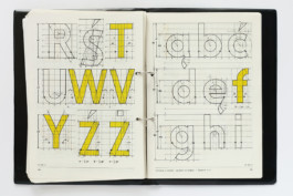
“Polskie Pismo Drogowe” as seen in Marek Sigmund’s manual. Image taken by Kuba Sowiński and kindly provided by Marian Misiak
It all started for me when I saw a sample of the typeface Polskie Pismo Drogowe used in Polish road signage. It was originally designed by Marek Sigmund in 1975 for the Ministry of Transportation. The typeface seemed to go against all conventions, was geometrically constructed with no optical compensations and quite brutal in nature but nevertheless charming and wonderfully naive in its approach. To find an example that was designed with little consideration for space and legibility in traffic sparked my curiosity for further searches.
London Airport Lettering
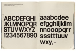
“London Airport Lettering” featured in the magazine Typographica 5 in June 1962. Image kindly provided by the Letterform Archive
Another interesting example is the London Airport Lettering signage typeface Matthew Carter drew for Colin Forbes’ sign system for the No. 3 Passenger Building of London Airport. The design is based on Standard Bold (the english name for Akzidenz Grotesk) but with a lower uppercase and shortened ascenders and descenders, the typical characteristics of a signage typeface. This way the London Airport Lettering was able to achieve larger letterforms on a spatially limited sign area. Note the steep curve with which the descender of the lowercase y changes its direction and the lowercase g, which has a drastically thinned out descender.
SBB signage
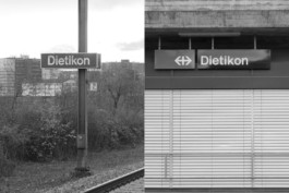
“Dietikon” signage in derogation from the SBB signage guidelines. Image taken by Mirco Schiavone at the trainstation of Dietikon, 2019
Being a designer in Switzerland you can imagine it’s impossible to escape the work of Josef Müller-Brockmann. His and his team’s work is omnipresent even for non-designers in the form of the SBB railroad company’s identity and signage system. For many it has become an integral part of the Swiss landscape. The typeface originally intended to be used exclusively was Rail Alphabet by Jock Kinneir and Margaret Calvert, although it was named Helvetica halbfett korrigiert (Helvetica Semi-Bold corrected) in the manual. To this day various typefaces like Rail Alphabet, Helvetica and sometimes even Arial can be found within the SBB signage system. Since 2016 the newly commissioned SBB Font developed by URW++ is being implemented to unify the appearance of the signage system.
Further references during the design process were, amongst others: Highway Gothic, Interstate, Rail Alphabet, Transport, Johnston Sans and various snippets of interesting signage examples not part of any elaborate system.
Design
However fascinating these examples were, it was never my intention to design another signage typeface to begin with. I started out by assembling and regrouping impressions and influences rather intuitively and building a shape vocabulary to use for the development of RT Rondelle without the typical requirements of a public signage typeface.
By slowly learning the language of various examples of the genre the idea for my own project became clearer throughout the process. RT Rondelle borrows characteristic attributes of signage typefaces and weaves them into its own personality to offer designers a versatile material to work with.
Vertical Proportions
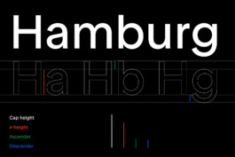
RT Rondelle sports a high x-height, which continuously grows throughout the family to reach its peak in the Black weight. A high x-height is a feature widely used to improve legibility at big distances but works just as well for type set in very small sizes. As the lowercase is higher in proportion to the uppercase the type appears bigger compared to fonts with a lower x-height. The distance between x-height and ascender height and between baseline and descender depth on the other hand is kept relatively small compared to the x-height. The short descenders save space below the baseline and allow designers to deliberately decrease leading for ultra-tight typesetting.
Horizontal Proportions
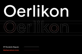
A recurring theme during the design process was the geometry within the letters. I’m referring to the visual appearance of the letters not the mathematical construction of geometric shapes. Although a constructional approach can of course produce interesting outcomes, the resulting typefaces are mostly not suited to perform well in various environments without drawing too much attention to single letters within a text.
I wanted to apply a more subtle and gentler approach to RT Rondelle. The round appearance of the typeface and the fitting contrast between vertical and horizontal strokes had to be carefully determined. I wanted optical corrections to fulfill their purpose but at the same time not apply more than necessary to keep that mono-line-look without the effect of the shapes closing up.
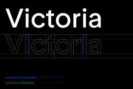
While the vertical metrics are all about economizing space the horizontal proportions of RT Rondelle are more generous and try to explore the boundaries within the framework of versatile functionality . The usually narrow letters like f j r t are drawn even narrower and the round letters like o c e b d p q are drawn rather wide lending the typeface a well balanced geometric feel emphasizing the rhythm in a letter sequence.
Wordmark Quality
What fascinated me most about signage typefaces is the wordmark-style in which some of them display words. Names of trainstations or single words indicating a specific direction are perceived by the reader, who is passing by rather quickly, more as an image than a written word. With this in mind I designed RT Rondelle to have a concise and compact appearance by referencing the characteristic features of the source material.
Thin
Edgware Road
Extralight
Upminster
Light
Camden Town
Book
Richmond
Regular
Shepherdʼs Bush
Medium
Heathrow
Bold
Oxford Circus
Black
Waterloo
Thin Italic
Deutsche Oper
Extralight Italic
Gleisdreieck
Light Italic
Hallesches Tor
Book Italic
Ruhleben
Regular Italic
Leopoldplatz
Medium Italic
Britz-Süd
Bold Italic
Osloer Straße
Black Italic
Wedding
The Family
The RT Rondelle Family spans from the delicate Thin, Extralight and Light weights through the steady middle weights of Book and Regular up to the impactful Medium, Bold and Black weights. The wide spectrum ensures a extensive applicability while completing the typeface with matching italics for each weight.
Thin
Antwerpen Centraal
Extralight
Liège-Guillemans
Light
Zürich Stadelhofen
Book
Paris Saint-Lazare
Regular
London King’s Cross
Medium
Madrid Chamartín
Bold
Marseille Blancarde
Black
Brussel Schuman
Thin Italic
Berlin Hauptbahnhof
Extralight Italic
Lille Europe
Light Italic
Oslo Sentralstasjon
Book Italic
Stazione Termini
Regular Italic
Praha Hlavní Nádraží
Medium Italic
Lyon-Part-Dieu
Bold Italic
Newcastle Central
Black Italic
Milano Centrale
Thin + Italic
Il treno regionale proveniente Genova è in arrivo al binario 6.
Extralight + Italic
Concorde! Attention à la marche en descendant du train.
Light + Italic
Ukončete výstup a nástup, dveře se zavírají. Příští stanice Zličín.
Book + Italic
Alexanderplatz! Dieser Zug endet hier. Bitte alle aussteigen.
Regular + Italic
Se upp för dörrarna, dörrarna stängs. Nästa stopp Tensta.
Medium + Italic
Urmeaza statia Apărătorii Patriei cu peronul pe partea dreapta.
Bold + Italic
Ihre nächsten Verbindungen: Intercity nach Lausanne Gleis 4.
Black + Italic
This is a Circle line train via Tower Hill and Liverpool Street.
Grown out of the inspiration found in road and public transport signage typefaces, RT Rondelle embarks on a new life of its own, leaving behind the restrictions of its heritage to form a consistent and independent type family.
Check out other Razzia typefaces:
Credits
Typeface
Website
Designed by Mirco Schiavone, RazziaType
Design, copy writing and documentation by Mirco Schiavone
RT Rondelle
RT Rondelle is the result of an exploration into public transport signage typefaces. While building on this foundation it incorporates the distinctive characteristics of a highly specialized genre to become a versatile grotesque with a balanced geometrical touch.
Origin
While starting my research I was especially interested in the custom tailored typographic solutions used to fulfill the requirements of this very specific environment under the clearly defined conditions of road and public transport signage. These design limitations produced purposeful formal solutions with a unique aesthetic and characteristic attributes. Nonetheless there are plenty of peculiar typefaces and letterforms to be found in this field.
Polskie Pismo Drogowe

POLSKIE PISMO DROGOWE as seen in Marek Sigmund’s manual. Image taken by Kuba Sowiński and kindly provided by Marian Misiak
It all started for me when I saw a sample of the typeface Polskie Pismo Drogowe used in Polish road signage. It was originally designed by Marek Sigmund in 1975 for the Ministry of Transportation. The typeface seemed to go against all conventions, was geometrically constructed with no optical compensations and quite brutal in nature but nevertheless charming and wonderfully naive in its approach. To find an example that was designed with little consideration for space and legibility in traffic sparked my curiosity for further searches.
London Airport Lettering

LONDON AIRPORT LETTERING featured in the magazine Typographica 5 in June 1962. Image kindly provided by the Letterform Archive
Another interesting example is the London Airport Lettering signage typeface Matthew Carter drew for Colin Forbes’ sign system for the No. 3 Passenger Building of London Airport. The design is based on Standard Bold (the english name for Akzidenz Grotesk) but with a lower uppercase and shortened ascenders and descenders, the typical characteristics of a signage typeface. This way the London Airport Lettering was able to achieve larger letterforms on a spatially limited sign area. Note the steep curve with which the descender of the lowercase y changes its direction and the lowercase g, which has a drastically thinned out descender.
SBB signage

SBB SIGNAGE in derogation from the SBB signage guidelines. Image taken by Mirco Schiavone at the trainstation of Dietikon, 2019
Being a designer in Switzerland you can imagine it’s impossible to escape the work of Josef Müller-Brockmann. His and his team’s work is omnipresent even for non-designers in the form of the SBB railroad company’s identity and signage system. For many it has become an integral part of the Swiss landscape. The typeface originally intended to be used exclusively was Rail Alphabet by Jock Kinneir and Margaret Calvert, although it was named Helvetica halbfett korrigiert (Helvetica Semi-Bold corrected) in the manual. To this day various typefaces like Rail Alphabet, Helvetica and sometimes even Arial can be found within the SBB signage system. Since 2016 the newly commissioned SBB Font developed by URW++ is being implemented to unify the appearance of the signage system.
Further references during the design process were, amongst others: Highway Gothic, Interstate, Rail Alphabet, Transport, Johnston Sans and various snippets of interesting signage examples not part of any elaborate system.
Design
However fascinating these examples were, it was never my intention to design another signage typeface to begin with. I started out by assembling and regrouping impressions and influences rather intuitively and building a shape vocabulary to use for the development of RT Rondelle without the typical requirements of a public signage typeface. By slowly learning the language of various examples of the genre the idea for my own project became clearer throughout the process. RT Rondelle borrows characteristic attributes of signage typefaces and weaves them into its own personality to offer designers a versatile material to work with.
Vertical Proportions

RT Rondelle sports a high x-height, which continuously grows throughout the family to reach its peak in the Black weight. A high x-height is a feature widely used to improve legibility at big distances but works just as well for type set in very small sizes. As the lowercase is higher in proportion to the uppercase the type appears bigger compared to fonts with a lower x-height. The distance between x-height and ascender height and between baseline and descender depth on the other hand is kept relatively small compared to the x-height. The short descenders save space below the baseline and allow designers to deliberately decrease leading for ultra-tight typesetting.
Horizontal Proportions

A recurring theme during the design process was the geometry within the letters. I’m referring to the visual appearance of the letters not the mathematical construction of geometric shapes. Although a constructional approach can of course produce interesting outcomes, the resulting typefaces are mostly not suited to perform well in various environments without drawing too much attention to single letters within a text. I wanted to apply a more subtle and gentler approach to RT Rondelle. The round appearance of the typeface and the fitting contrast between vertical and horizontal strokes had to be carefully determined. I wanted optical corrections to fulfill their purpose but at the same time not apply more than necessary to keep that mono-line-look without the effect of the shapes closing up.

While the vertical metrics are all about economizing space the horizontal proportions of RT Rondelle are more generous and try to explore the boundaries within the framework of versatile functionality . The usually narrow letters like f j r t are drawn even narrower and the round letters like o c e b d p q are drawn rather wide lending the typeface a well balanced geometric feel emphasizing the rhythm in a letter sequence.
Wordmark Quality
What fascinated me most about signage typefaces is the wordmark-style in which some of them display words. Names of trainstations or single words indicating a specific direction are perceived by the reader, who is passing by rather quickly, more as an image than a written word. With this in mind I designed RT Rondelle to have a concise and compact appearance by referencing the characteristic features of the source material.
Thin
Edgware Road
Thin
Upminster
Light
Camden Town
Book
Richmond
Regular
Shepherdʼs Bush
Medium
Heathrow
Bold
Oxford Circus
Black
Waterloo
Thin Italic
Deutsche Oper
Extralight Italic
Gleisdreieck
Light Italic
Hallesches Tor
Book Italic
Ruhleben
Regular Italic
Leopoldplatz
Medium Italic
Britz-Süd
Bold Italic
Osloer Straße
Black Italic
Wedding
The Family
The RT Rondelle Family spans from the delicate Thin, Extralight and Light weights through the steady middle weights of Book and Regular up to the impactful Medium, Bold and Black weights. The wide spectrum ensures a extensive applicability while completing the typeface with matching italics for each weight.
Thin
Antwerpen Centraal
Extralight
Liège-Guillemans
Light
Zürich Stadelhofen
Book
Paris Saint-Lazare
Regular
London King’s Cross
Medium
Madrid Chamartín
Bold
Marseille Blancarde
Black
Brussel Schuman
Thin Italic
Berlin Hauptbahnhof
Extralight Italic
Lille Europe
Light Italic
Oslo Sentralstasjon
Book Italic
Stazione Termini
Regular Italic
Praha Hlavní Nádraží
Medium Italic
Lyon-Part-Dieu
Bold Italic
Newcastle Central
Black Italic
Milano Centrale
Thin + Italic
Il treno regionale proveniente Genova è in arrivo al binario 6.
Extralight + Italic
Concorde! Attention à la marche en descendant du train.
Light + Italic
Ukončete výstup a nástup, dveře se zavírají. Příští stanice Zličín.
Book + Italic
Alexanderplatz! Dieser Zug endet hier. Bitte alle aussteigen.
Regular + Italic
Se upp för dörrarna, dörrarna stängs. Nästa stopp Tensta.
Medium + Italic
Urmeaza statia Apărătorii Patriei cu peronul pe partea dreapta.
Bold + Italic
Ihre nächsten Verbindungen: Intercity nach Lausanne Gleis 4.
Black + Italic
This is a Circle line train via Tower Hill and Liverpool Street.
Grown out of the inspiration found in road and public transport signage typefaces, RT Rondelle embarks on a new life of its own, leaving behind the restrictions of its heritage to form a consistent and independent type family.
Check out other Razzia typefaces:
Credits
Typeface
Designed by Mirco Schiavone, RazziaType
Website
Design, copy writing and documentation by Mirco Schiavone